Difference between revisions of "Logo History"
StockAvuryah (talk | contribs) |
|||
| Line 59: | Line 59: | ||
</gallery> | </gallery> | ||
| − | ===[[ | + | ===[[NIN 2017-2018]]=== |
<gallery> | <gallery> | ||
Image:Coldandblacklogo.png|''Cold and Black and Infinite'' logo | Image:Coldandblacklogo.png|''Cold and Black and Infinite'' logo | ||
Image:europe2018.png|''Europe 2018'' logo | Image:europe2018.png|''Europe 2018'' logo | ||
</gallery> | </gallery> | ||
Revision as of 09:12, 3 July 2018
Nine Inch Nails has had many logos throughout its history, and while the original logo is still considered the band's "main" logo, this is a list of all logos that have been used over the years.
Contents
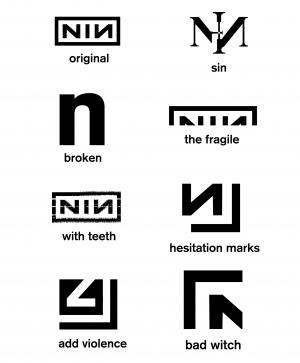
Original
Designed by Gary Talpas, based on Trent Reznor's concept.
On Tour
A stencil variant used to mark touring cabinets and equipment.
Sin
Designed by The Designers Republic, used on the Sin single.
Broken
Designed by Talpas, used on both Broken and Fixed.
The Fragile
Original logo partly hidden on The Fragile cover art.
With Teeth
Designed by Rob Sheridan, based on the Talpas original.
Live: With Teeth
Many tour posters had variations on the Sheridan theme, glitch manipulation of the Talpas logo.
The Slip
Designed by Sheridan, used only on the album booklet.
Hesitation Marks
The Trilogy
Add Violence logo
Bad Witch logo


