Pretty Hate Machine
Pretty Hate Machine (also known as Halo 2) is the first studio album by Nine Inch Nails, released on October 20, 1989 by TVT Records and was a huge success. The first single off of the album, Down In It, was released on September 27, 1989. It received radio airplay for the aforementioned single as well as subsequent singles Head Like A Hole and Sin.
Track Listing
CD
- "Head Like A Hole" – 4:59
- "Terrible Lie" – 4:38
- "Down In It" – 3:46
- "Sanctified" – 5:48
- "Something I Can Never Have" – 5:54
- "Kinda I Want To" – 4:33
- "Sin" – 4:06
- "That's What I Get" – 4:30
- "The Only Time" – 4:47
- "Ringfinger" – 5:40
- The 2010 remastered edition adds "Get Down, Make Love," originally a B-side on Sin, on the end.
12" Vinyl
A1 "Head Like A Hole" – 4:59
A2 "Terrible Lie" – 4:38
A3 "Down In It" – 3:46
A4 "Sanctified" – 5:48
A5 "Something I Can Never Have" – 5:54
B1 "Kinda I Want To" – 4:33
B2 "Sin" – 4:06
B3 "That's What I Get" – 4:30
B4 "The Only Time" – 4:47
B5 "Ringfinger" – 5:40
- The 2010 remastered edition is split across three sides: side 1 has A1 through A4, side 2 has A5 through B3, and side 3 has B4 & B5 along with "Get Down, Make Love" on the end.
Recording
Working nights at Right Track Studio as a handyman and toilet cleaner, Trent Reznor used studio "down time" to record and develop his own music. Playing most of the keyboards, drum machines, guitars, and samplers himself, he recorded a demo, unofficially titled Purest Feeling.
Teaming up with manager John A. Malm, Jr. they sent the demo to various record labels. Reznor received serious offers from many of them. He signed a deal with TVT Records who, until then, were known mainly for releasing novelty and television jingle records.
Pretty Hate Machine was recorded in various studios around the world with Reznor collaborating with some of his most idolized producers - Flood, Keith LeBlanc, Adrian Sherwood, and John Fryer.
Touring
For more information, see Pretty Hate Machine Tour
The album also gained popularity through word-of-mouth and developed an underground following. Reznor quickly hired a band for touring with The Jesus and Mary Chain, including guitarist and future Filter/Army of Anyone frontman Richard Patrick. Nine Inch Nails' live set was notorious for louder, more aggressive versions of the studio songs, and also for destroying their instruments at the end of sets. Reznor preferred using the heel of his boots to strip the keys from keyboards.
Purest Feeling
Since the album was released, a recording known as Purest Feeling surfaced. This bootleg album contains the original demo recordings of most of the tracks found on Pretty Hate Machine, as well as a couple that were not used ("Purest Feeling" and "Maybe Just Once").
Tributes
The entire album was covered by a string quartet in 2005 as The String Quartet Tribute to Nine Inch Nails' Pretty Hate Machine, arranged by Eric Gorfain. [1] It was later re-arranged using retro computers and game consoles by Inverse Phase and released as Pretty Eight Machine. [2]
Rykodisc Re-Release
Pretty Hate Machine went out of print through TVT Records, but was reissued by Rykodisc Records on November 22, 2005 with slight changes in the packaging. Prudential owned TVT's Nine Inch Nails recordings, but Rykodisc leased the rights. Reznor had expressed an interest in creating a "deluxe edition" with surround sound remastering and new/rare remixes, similar to the re-release of The Downward Spiral. Rykodisc liked the idea, but not enough to pay Reznor to do so.
Bicycle Music Re-Release
In April 2010, Bicycle Music bought the entirety of TVT's catalogue, including Pretty Hate Machine. They confirmed that they would be reissuing the album once more, and there was speculation that they would be willing to release the deluxe edition proposed by TVT in 2005.
The co-publishing rights to Trent Reznor’s Nine Inch Nails catalog include the songs from all album releases from Pretty Hate Machine through Year Zero. As well, in acquiring the master recording rights to NIN’s groundbreaking debut, Pretty Hate Machine, Bicycle will be responsible for re-releasing this album which has been out of print and unavailable through digital distribution outlets for several years. “It goes without saying how important these works are to the entire landscape of Alternative Rock. Our team sees incredible creative and business opportunities with this catalog and we look forward to working with our new partners and artists," said Steve Salm, Partner at Bicycle.
On October 22, Reznor announced that the reissue was to be a remastered edition, stating on nin.com[3]:
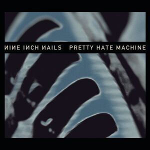
I'm happy to finally announce the re-issue of the first Nine Inch Nails record "Pretty Hate Machine", releasing worldwide 11/22. UMe and Bicycle Music Group managed to locate the original mixes, so I went in the studio with Tom Baker and remastered it for a greatly improved sonic experience. In addition, Rob reinterpreted Gary Talpas' original cover to make for a fresh new package.
It's been an interesting trip watching the fate of this record float from one set of hands to another (a long and depressing story) but it's finally wound up in friendly territory, allowing us to polish it up a bit and present it to you now. We had fun revisiting this old friend, hope you enjoy.
TR
The nin.com subsite phm.nin.com was set up to promote the re-release.
In March 2011 an ETS user named wishtheend contacted Tom Baker at Precision Mastering with some questions about the mastering of the re-release:
- Vinyl was mastered from hi-res/24-bit source audio (i'm going to guess 96khz, but he didn't specify)
- The CDs had a separate production master, made from the same hires/24-bit source the Vinyl Production Master was made from)
- The Vinyl Production Master was about 4-6db RMS lower (maybe more) than the levels the CD Production Master was taken to
- When the actual vinyl discs were cut, an additional low-filter (hipass), desser and hyper-elliptical filter were put in place.
Artwork
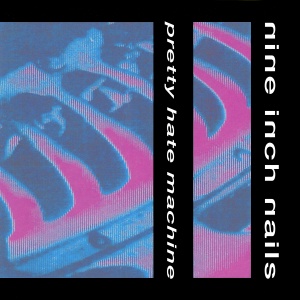
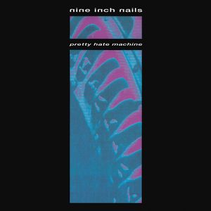
Reznor stated in one of his posts on the Prodigy internet service in the early 90s that "the cover of PHM is a photo of the blades of some sort of turbine stretched vertically so they would look somewhat like bones or a rib cage."[4]
In an interview with Sleevage.com, Rob Sheridan described the long process he went through to update the artwork for the re-issue:
"When we began the Pretty Hate Machine remaster project, Trent discussed with me the idea of tweaking the original artwork a bit to reflect that this was a different version of the album, updated from its original release. We talked about maybe just changing the color scheme a bit – Trent was keen on losing the distinctly 80′s hot pink color, for one. It seemed like a fairly straightforward project, as I certainly didn’t want to try and radically alter an album cover I’d been looking at since I was a teenager, and that some fans had known very well for more than two decades.
The first bump in the road was that no one had the original artwork. We left no stone unturned – we even reached out to the original designer, Gary Talpas, but he had given all his materials to Nothing Records long ago. Our best guess is that those materials were lost somewhere in Trent’s split with his old management. I tried scanning the old vinyl cover, but it was poorly printed and looked like an absolute mess when scanned. Even after cleaning it up a bit, attempting to separate the colors was fairly disastrous, and the resolution was terrible.
In 2004 I redesigned NIN’s The Downward Spiral for its 10th anniversary Deluxe Edition. In that case, Trent still had all of Russell Mills’ original art pieces that were used in the album, so I was able to re-photograph them and present the artwork in a new and interesting way. With this album, I didn’t have that luxury. It became clear to me that I was going to have to start from scratch.
I tried a number of different approaches – I even got some various mechanical parts from hardware stores and arranged them in a way that resembled the shape of the cover image (I’d remembered reading long ago that the original image was taken of some sort of factory machine, with spokes that looked like ribs), and photographed it in different ways, then attempted to push the contrast of the photos and pull shapes out of them. Nothing was working out very well though. It either looked too far away from the original cover, or like a weird, sad imitation of it.
Finally, I decided to painstakingly recreate the original cover as closely as possible. Using my scan of the original as a template, I digitally painted the image in extremely high resolution, the same way I’d approach an illustration. I used a meticulous set of masks to recreate the “interlaced” horizontal line effect of the original cover. After a lot of trial-and-error, I eventually finished with a new version of the original artwork, created in a very different way, but retaining the same spirit.
At this point I was free to play with the color scheme. I tried a wide variety of colors, ranging from darker, more muted versions of the original color scheme, to ones that looked nothing like the original. The favorite – both of Trent and myself – was the dark blue/blue/off-white combo used in the final image. It was a bit similar to a PHM t-shirt that’s been around for a while, so there was a sense of familiarity in the colors.
I then carefully recreated the title font from the original cover, and the black frames it sat in. The font, a stretched-out version of Helvetica, looked dated to me, but I wanted to be respectful of the original design and not mess with it too much. When Trent saw what I’d done though, he wanted to try a new approach to the title text, as he felt the font was just too dated and could use a more modern look for this remaster. So I went back to the original album and looked at the font that had been used for the credits and lyrics, which turned out to be a slight variation of a font Gary Talpas later used in The Downward Spiral. Putting the PHM title in that font was way too similar to The Downward Spiral, but when I put it in caps it created an odd mix of vintage NIN and modern NIN – perfect for a 2010 remaster of a 1989 album. Trent liked this approach much better, and we settled on the way we wanted the title set on the album cover. The image sitting behind it – my recreated artwork – still felt a bit flat, though.
To push the art a bit further, I got the idea of printing the image out at a very high DPI and photographing it with a narrow depth of field, allowing parts of it to fall out of focus. This gave a new depth to the previously flat artwork, and it turned out to be exactly what the image was missing. After quite a few experiments, I ended up with the image that is now the cover, and immediately felt I’d finally gotten this thing to where I’d wanted it to be. I sent it to Trent without any of the type or anything on it, and while he’d been somewhat lukewarm on the previous material, he was immediately excited about this one. “That looks fucking great,” he told me, “we’ve got it.” I put the black frame and our new type treatment over the new cover image, and everything clicked. The new cover, with the unmistakable shape of the “ribs” and the interlacing effect, remained respectful to the original and still recognizable, while adding a more modern feel and a “fresh coat of paint” on the colors. This is not meant to replace the original cover. This is the cover for this 2010 remastered edition of the album.
The original CD cover was oriented sideways, which had never felt right to me, as the vinyl cover had a distinct vertical orientation of the full image (something I preserved in the new vinyl edition). I’d always wondered if it was a byproduct of the way the insert needed to sit in the jewel case. Either way, I wanted to bring the vertical orientation over to the CD this time around, but I also wanted to preserve the way the whole image folded out from the cover in the original CD insert. We certainly didn’t want to put this in a jewel case, so to accomplish the vertical fold-out, I came up with a unique L-shaped digipak package, where a panel folds down from the cover to reveal a vertical extension of the artwork. I also decided to put the black frame and the title text on a transparent O-card that slides over the digipak (very similar to what we did on The Downward Spiral Deluxe Edition) – so when you slide the O-card off, the image underneath is bare. It turns the black “frame” around the image into an actual frame, adding a new layer of depth to the art.
For the remainder of the package, I was cautious not to add much extra artwork and overdo it. The original sleeve was extremely minimal, only using type on black amidst a few variations of the cover image here and there for the internal art, so I wanted to preserve that. Some might say it’s boring to have plain black pages with text on them for the lyrics, but I’d rather stay true to what had been done previously than add a bunch of art and risk having it feel like an altogether different album. The only other piece of art in the original insert was a photograph of Trent. Revisiting that, Trent wasn’t incredibly excited about including it in this version, and we didn’t have the original photograph anyway, so we left it out.
Throughout this process, I was very concerned with being respectful to the original artwork. This is not my album, and as a fan for many years, I have the same attachment to the original art that many other fans do. So my tendency was to play it safe, but it was Trent who felt a bit less precious about the original art, and he pushed me to do something that was visually further away from what I had originally intended. I think in the end we found a great middle ground, and we’re both really pleased with how it turned out. Recreating the art – somewhat by necessity – was a huge honor, and so far it seems fans are generally pretty pleased with what we’ve done…even if there’s no pink in it.
The only rejected ideas were my own ideas that I rejected before I showed them to anybody – mostly in the department of trying to recreate the artwork photographically. That was the only time I was tempted to do something dramatically different from the original art – for the most part my instinct was to not drift very far from the original, as it just didn’t feel right to me. Redesigning an album you listened to over and over again as a teenager is a pretty strange task, so I was understandably cautious.
I don’t know what Gary thinks of the new design, but he was very friendly when we reached out with him and said he really liked all the stuff we’ve been doing with NIN’s design in recent years. I hope he appreciates what we did with the new cover. I thought it was going to be a simple job, but the fact that we didn’t have the source art made it actually quite a project. Between my various failed experiments at recreating the art photographically, the meticulous way I ended up doing it by hand, and the amount of finessing it took to find the right presentation, it was actually quite a bit of work, and we had a pretty abrupt deadline for it. All things considered I’m pleased with the way it turned out."
Album Credits
- Nine Inch Nails is Trent Reznor
- Exclusive representation: John A. Malm, Jr. for J Artist Management
- Invaluable assistance: Chris Vrenna
- Drone guitar at the end of "Sanctified:" Richard Patrick
- Additional synth programming: Flood, Tim Niemi
- Digital editing and continuity: Trent Reznor, Chris Vrenna
- Mastering: Tony Dawsey at Masterdisk, NYC
- Sleeve: Gary Talpas for Föhn Design
- Portrait photography: Jeffrey Silverthorne
- Thank you: Bart Koster (The Right Track), Mike Shea, Michael S. Toorock, Roz Earls, Seb Shelton, Bryan Grant, Larry Bole, Alison Fryer, Michelle de Frasia, Gerry Gerard, Martin Horne, Sioux Zimmerman, Paul Conelly, Ron Musarra, Steve Woolard, Mark Jowett and all at Nettwek, Howie Klein, Preston Sullivan/Carlyle, Kevin Donoghue/Native, Frederic Wahleer/Sub Rosa
- Special thanks: All at TVT Records, James Dowdall and everybody at Island
- Kicking ass way beyond the call of duty: John A. Malm, Jr.
- Ideas and sounds (with all due respect): Clive Barker, Jane's Addiction, Prince, Public Enemy, This Mortal Coil, Success (Screaming Trees U.K.), various unknown others
- All songs written, arranged, programmed, and performed by Trent Reznor
- Studios: The Right Track (Cleveland), Blackwing (London), Unique (New York), Synchro Sound (Boston), Roundhouse (London)
It should be noted that the line "Kicking ass way beyond the call of duty: John A. Malm, Jr." is not present in the RYKO CD rerelease.
2010 Remaster Credits
- nine inch nails is trent reznor
- produced by trent reznor with flood, john fryer, keith leblanc, adrian sherwood
- mastered by. tom baker at precision mastering (hollywood)
- art direction. rob sheridan
- original sleeve. gary talpas
- remastering preparation. blumpy
- studios. the right track (cleveland), blackwing (london), unique (new york), synchro sound (boston), roundhouse (london)
- thank you. chris vrenna, bart koster, ross rosen, michael patterson, bicycle
- fuck you. steve gottlieb and tvt
- exclusive representation. rebel waltz, inc.
- www.nin.com
- all songs written, arranged, programmed, and performed by trent reznor.
- except as noted*
- ©1989-2010 ARLOVOL MUSIC/LEAVING HOPE MUSIC. ADMIN. BY PENNY FARTHING MUSIC (ASCAP)
Releases
- TVT Records TVT 2610-1 - 12" Vinyl
- TVT Records TVT 2610-2 - CD
- Rykodisc RLP 10836-1 - 12" Vinyl
- Rykodisc RCD 10836 - CD
- Bicycle B0015099-02 - CD
External Links
- Bicycle Music press release confirming their purchase of Pretty Hate Machine
- Reissue press release
- Interview with Rob Sheridan about the cover redesign
- Official remaster website
- Pretty Hate Machine at nincatalog.com
- Pretty Hate Machine at nincollector.com
- Pretty Hate Machine at Amazon
- Pretty Hate Machine at eBay
|


